Packaging Development
Colour and Finish: Giving Packaging Its Character
Colour, surface and decoration shape the character of a pack. Three practical decisions to make before approving the sample.
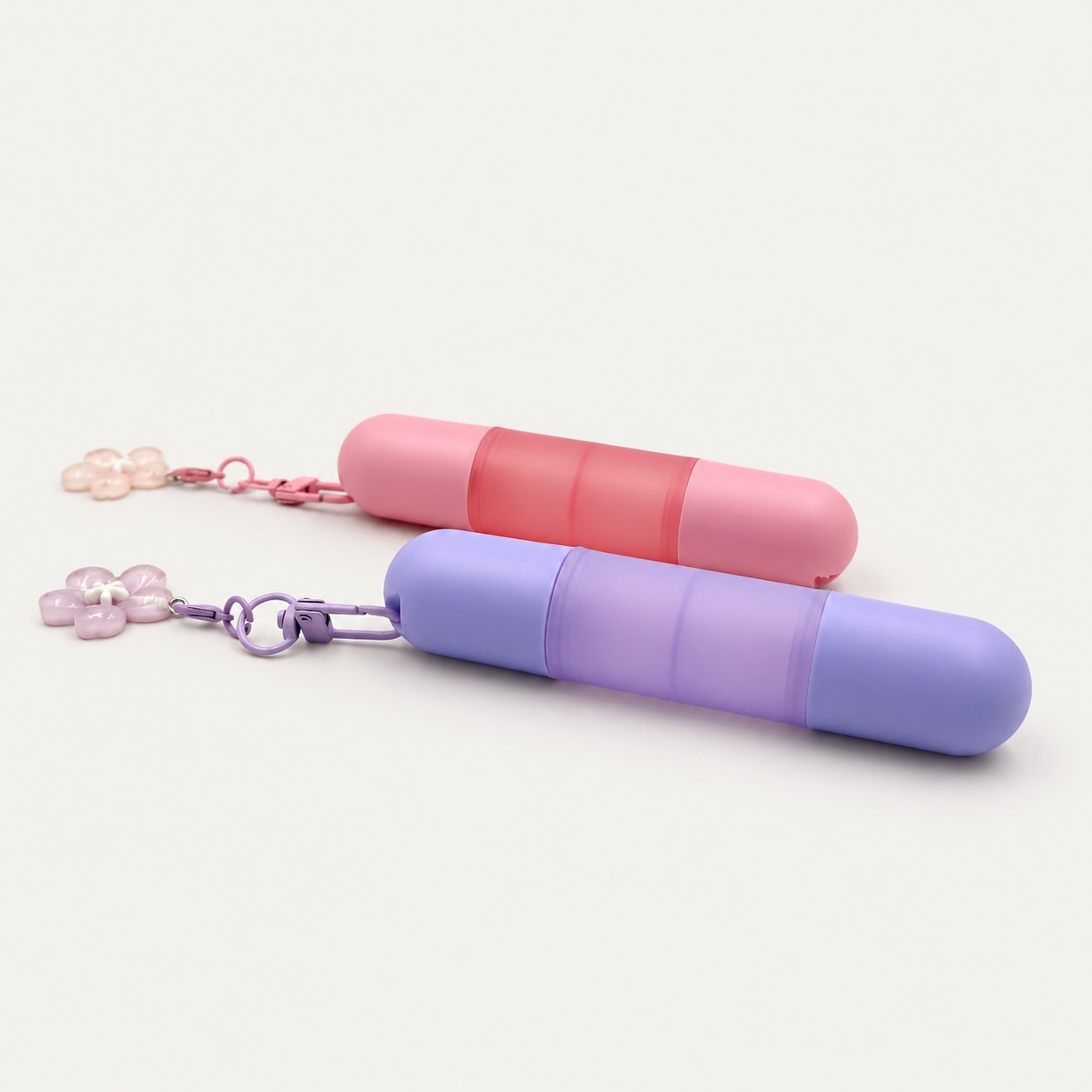
A familiar bottle or tube can take on a different character through colour, surface finish and decoration. The useful question is which combination expresses the brand clearly and works as a complete pack.
Start with a clear colour direction
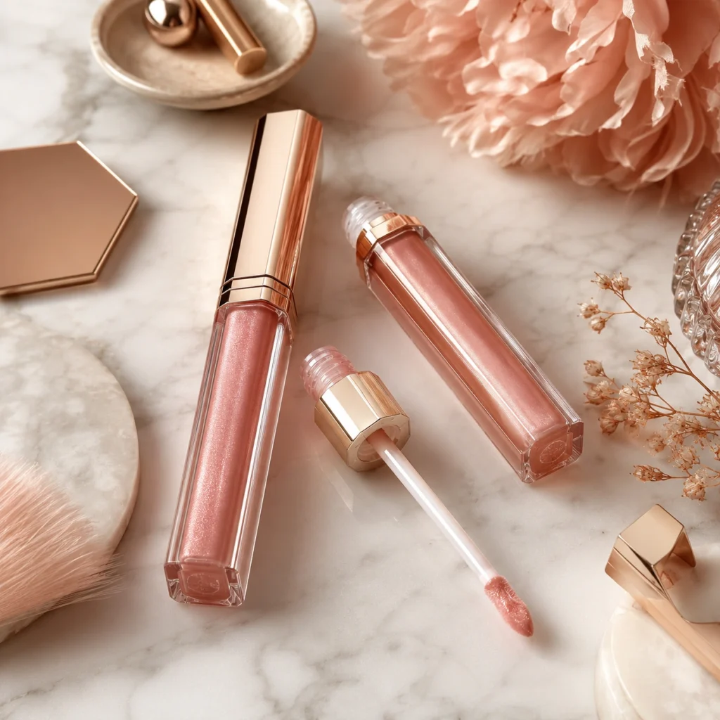
Choose the role of colour before choosing the shade. Is it there to connect a product family, distinguish variants or draw attention to one detail? A restrained colour system gives each element a purpose.
Use a physical reference when developing the selected direction. Review it on the intended material rather than relying only on a screen image, and agree how the sample will be assessed.
Look at the surface as well as the shape
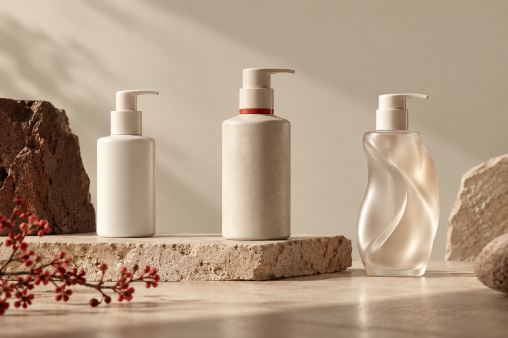
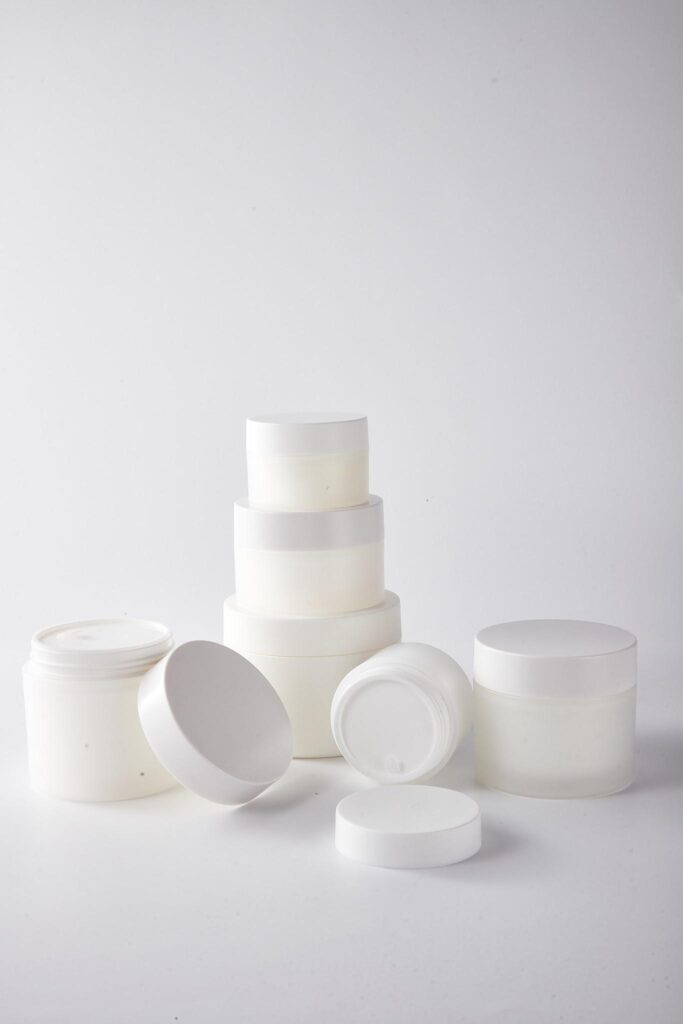
Compare the available finishes on actual samples. Look at how light moves across the surface and how the bottle, cap and decoration read together. A finish that works on one component may need a different approach on another.
Ask which treatments are possible for the selected pack, then consider them alongside the artwork and production requirements. There is little value in approving a visual direction that the proposed configuration cannot deliver.
Let the details work together
Place the assembled sample next to the rest of the range. Check the balance between the body colour, closure, logo and any printed information. Decide what should attract attention first and what should stay quiet.
Keep the approved physical sample as a shared reference for the next stage. It makes the conversation with the supplier more specific than descriptions such as premium or soft.
At Premiumpack LTD, we help brands bring colour, finish and packaging choices into the same conversation, then coordinate the sampling details with the relevant suppliers.